
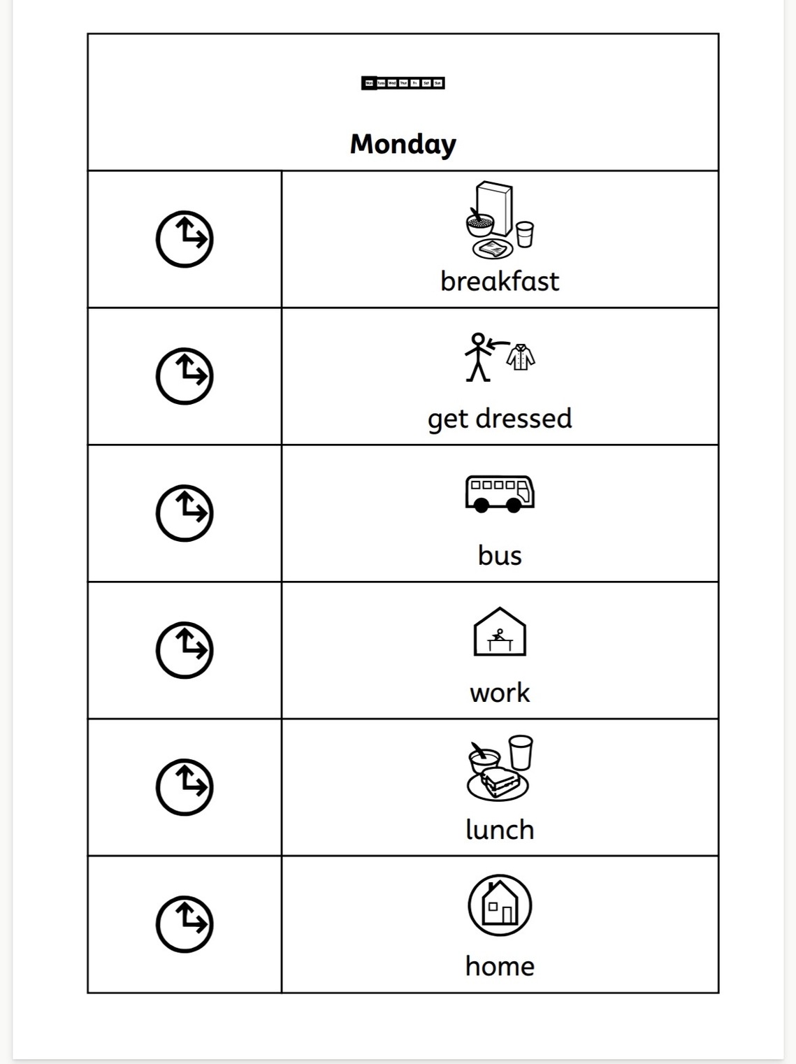
Symbol-based visual supports can be incredibly useful for supporting understanding, choice, independence and communication. They can also be surprisingly simple to make. This article focuses on visual supports made using Makaton symbols, although these are just one option. Depending on the individual and the purpose, photographs, objects, written words or other visual cues may be more appropriate.
You don't necessarily need specialist software or beautifully designed resources. You can hand-draw Makaton symbols, or, if you have access to the Makaton Library, download the symbols you need and add them to a Word document, Google Doc or PowerPoint.
Another option is Widgit Communicate: In Print, which allows Makaton symbols to be integrated into documents and includes lots of useful templates for creating visual supports.
But once you start making them, a couple of questions nearly always come up:
Should the word go above or underneath the symbol?
And:
Should a visual timetable run across the page or down it?
The answer isn't simply about which one looks nicest. We need to think about how the person using the visual support is going to access the information.
Symbol above or below the word?
Makaton convention is to place the symbol above the word. The symbol is generally the larger, more visually prominent piece of information and is likely to attract attention first. Placing the written word underneath means that, having accessed the meaning through the symbol, the eye can continue down to the written word. This arrangement also works well when symbols are used to support key words within written text. The words remain in their natural position within the sentence, with the symbols sitting above them, and someone tracking the text with their finger can track underneath the words. You may have seen other symbol systems where the written word appears above the symbol. This is common in some AAC systems and is sometimes recommended to increase exposure to print or to keep the word visible when a user selects the symbol. Different systems have developed different conventions for different purposes. When creating resources using Makaton symbols, I recommend following the Makaton convention: symbol above, word underneath.
Should a visual timetable run across the page or down it?
There isn't one layout that will be right for every Makaton user.
Across the page - left to right has an obvious connection with literacy. In English, that's the direction in which we read, so first → next → then progresses in a familiar direction. It can also work particularly well for a short sequence such as a Now and Next board.
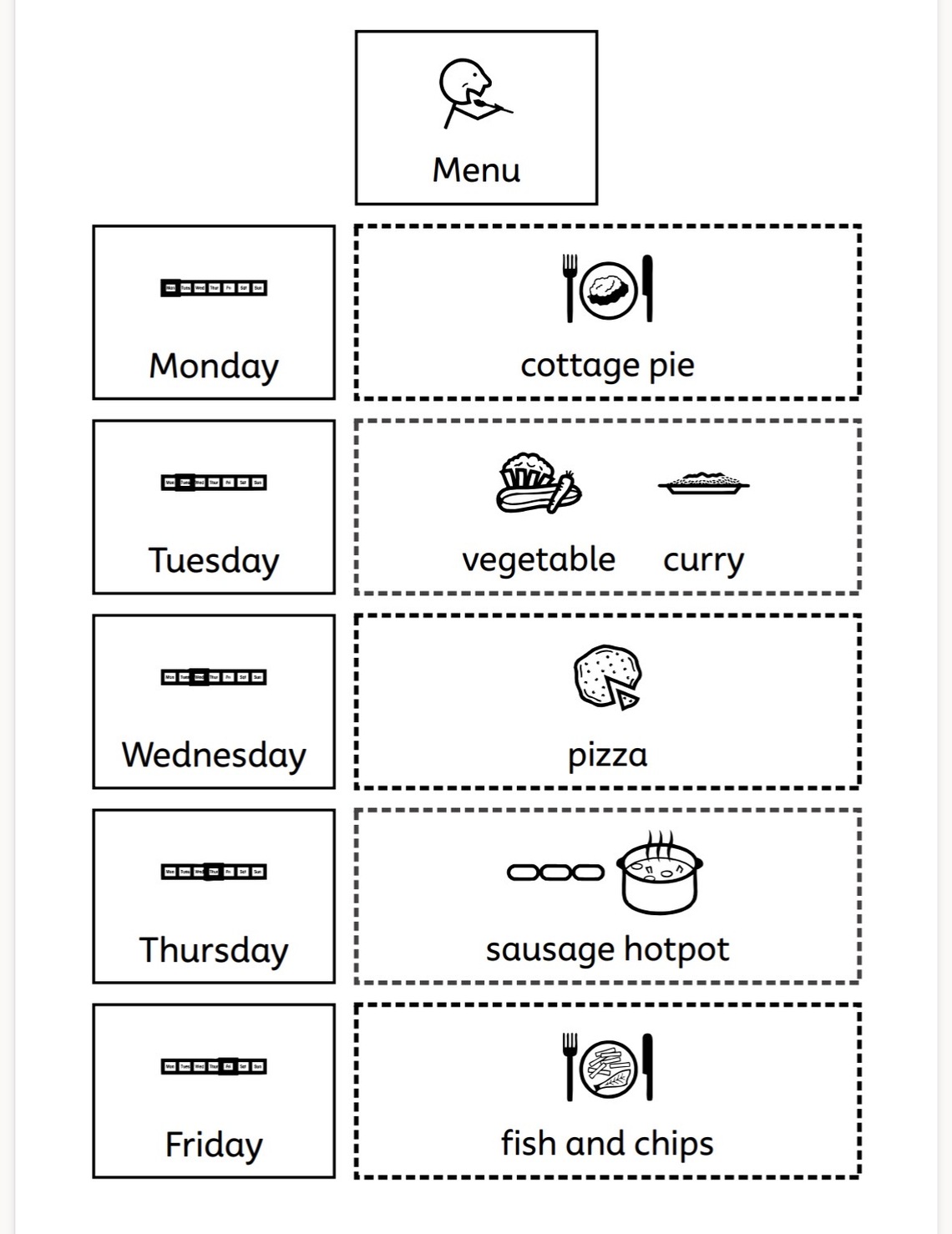
Down the page - top to bottom has different advantages. It creates a very obvious sequence and lends itself well to a longer day: you start at the top and work your way down. Activities can be removed, ticked or crossed off as they're completed, and the next activity remains immediately below.
But there's another consideration I think is more important than either convention:
How does the Makaton user understand time and sequence?
Think about what the timetable needs to tell them. It might be:
- What am I doing now?
- What's happening next?
- When is lunch?
- When am I going home?
- Is something different today?
- How much have I got left to do?
And that changes what you make.
Someone might benefit from seeing their whole day vertically. Someone else might find eight symbols completely overwhelming and get far more from Now → Next. Another person might need an activity removed as soon as it's finished so they can physically see the day getting shorter.
Does it really matter which way it goes? Probably less than we sometimes think. There isn't one correct direction for a visual timetable. If the person already uses and understands a particular layout, there may be no reason to change it. If you're starting from scratch, choose a clear, simple layout and use it consistently. What matters most is that the timetable helps the person understand what is happening and what comes next.
A useful visual support that is actually used is far more valuable than a theoretically perfect one that never gets made.
About the author
Nic Pike is Director of Better Communication Together CIC and a Licensed Makaton Tutor and Tutor Training Facilitator. She writes about Makaton, accessible communication and inclusive practice, drawing on over 40 years' professional experience and lived experience as a parent of a Makaton user.
© 2026 Better Communication Together CIC. All rights reserved.
This article is provided for personal learning and information. Please link to this page rather than copying or republishing the content.
Tags: